SmartShop is the code name for a software project that will bring the autobody industry into the modern age.
Using Bluetooth beacons, the vehicles, keys, equipment and staff in the autobody repair location will communicate with each other. The status of a vehicle’s repairs and keeping keys from becoming lost are just the beginning.

Goals of the app:
- Management will be able to determine the status of repairs, which vehicles are closing in on the date estimated they’d be ready.
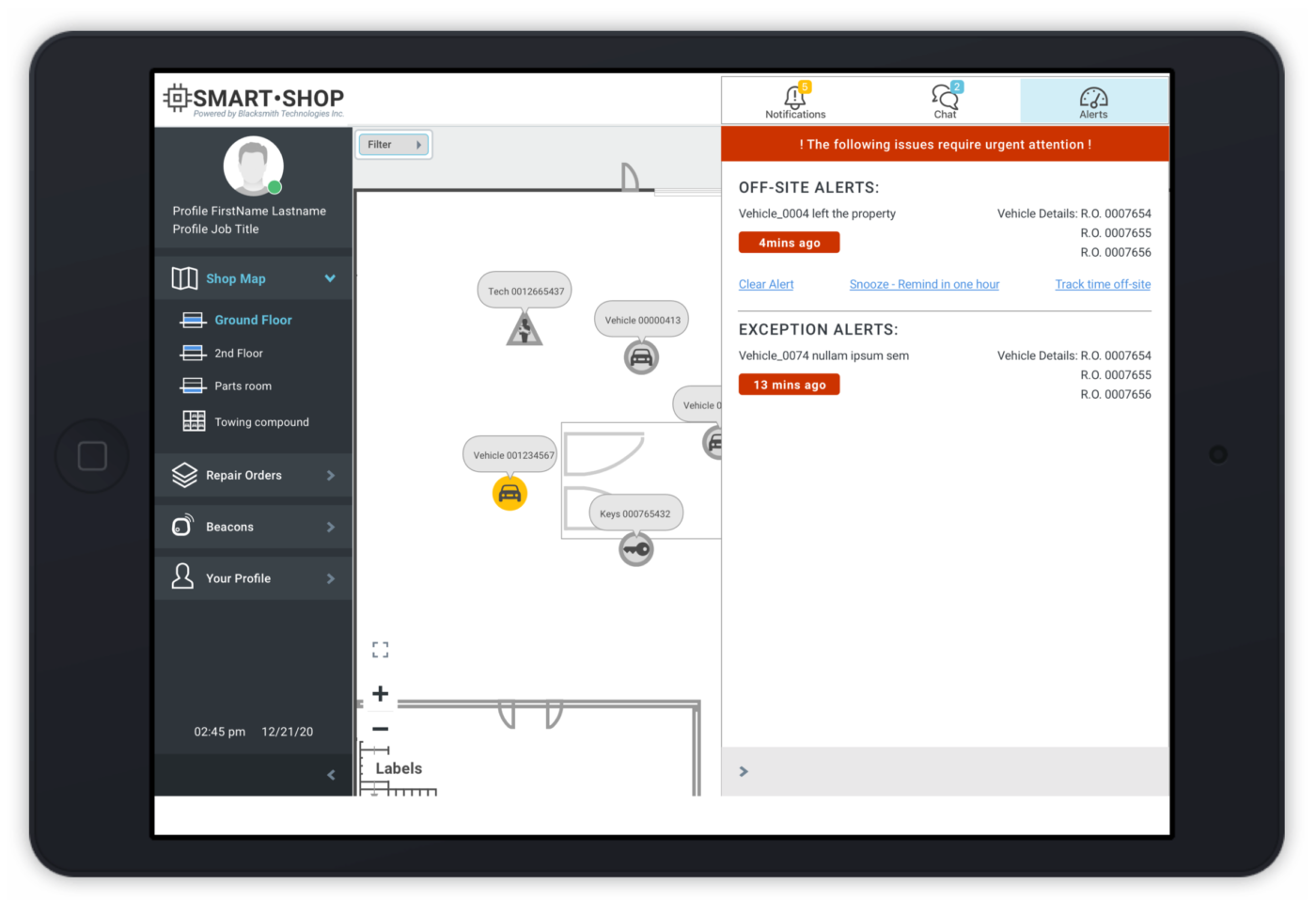
- Technicians can flag vehicles with a dead battery, missing keys or other issue that would affect repair progress. The vehicle’s icon will change colour and a notification will be sent to users.
- Equipment that is performing poorly or in need of maintenance will alert the software when it’s vibrations, detected by the beacon hardware, are out of spec.
- Staff will be alerted when vehicles leave the property, to make sure it’s an authorized trip to have a third party take care of one aspect of the repair (such as windshield replacement)
This project was a different challenge for me because the team was looking for a UI Designer, who would only create icons and graphics for the application. Typically I work with a visual designer or there’s existing branding or a design system where I can select interface elements. For this project we selected a UI framework with many options for buttons, form fields and alert popups. The elements were either customized to suit our use of them, or created from scratch.
Here is a clip of an early demo of the bluetooth beacon tracking, live from a small autobody shop outside Vancouver:
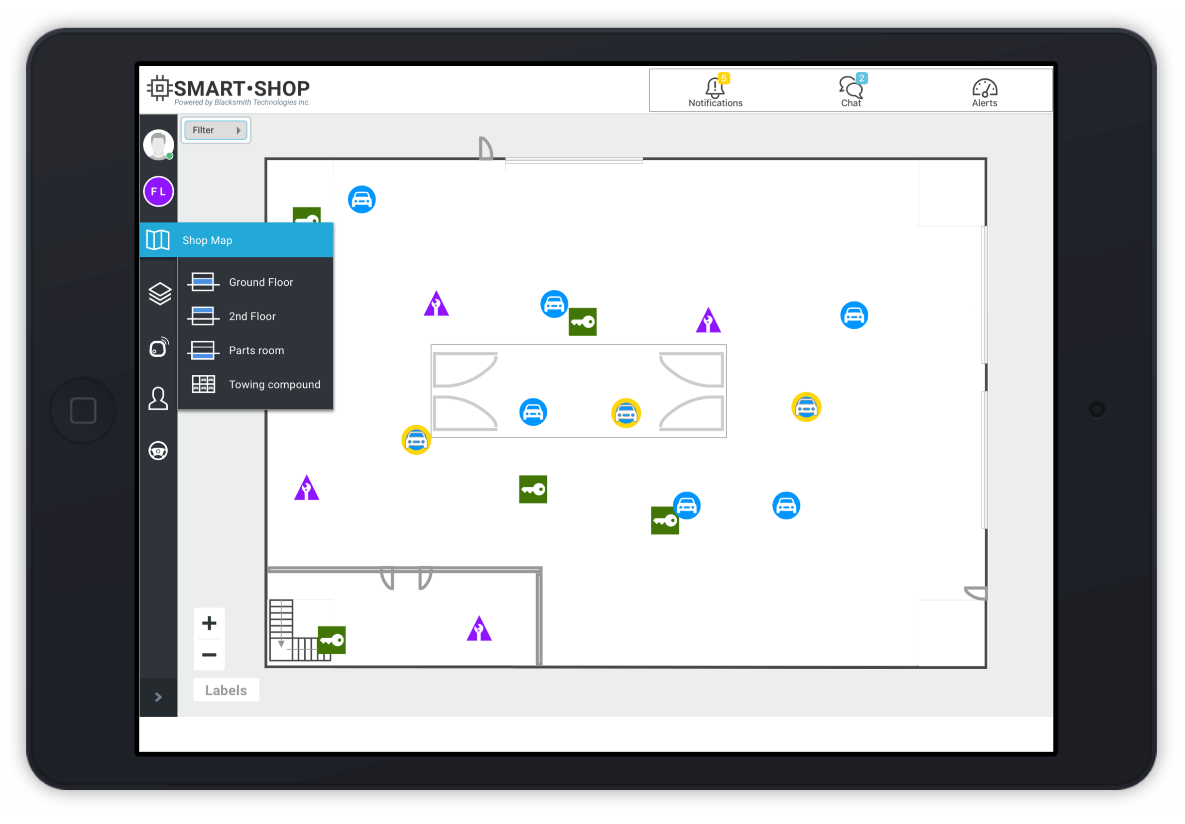
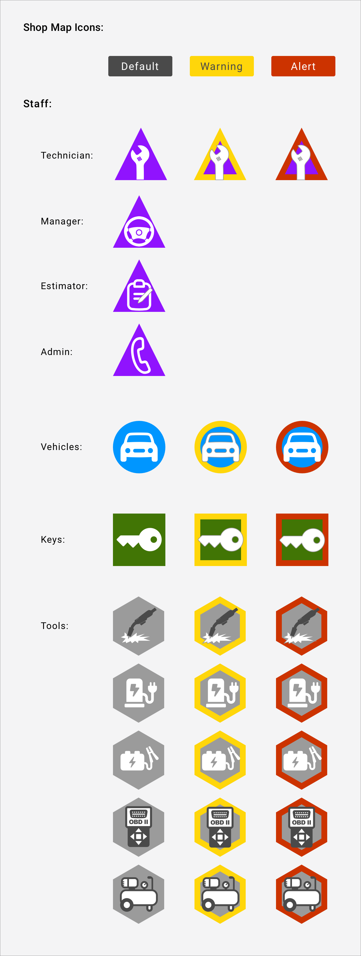
Custom icons were created for the app’s ‘Shop Map’ floorplan view. Visibility and legibility was important since the icons would be very small and sometimes overlapping when displayed upon the floorpan of a large facility. Shapes and colour were used to distinguish the icons from each other and convey the status of the item. And the client wanted colour! In the graphic they look as if the colour is a bit overboard, but this shows why it’s important to test designs. You can see on the map video that the colour is subtle when zoomed out and the icons are at their tiniest.
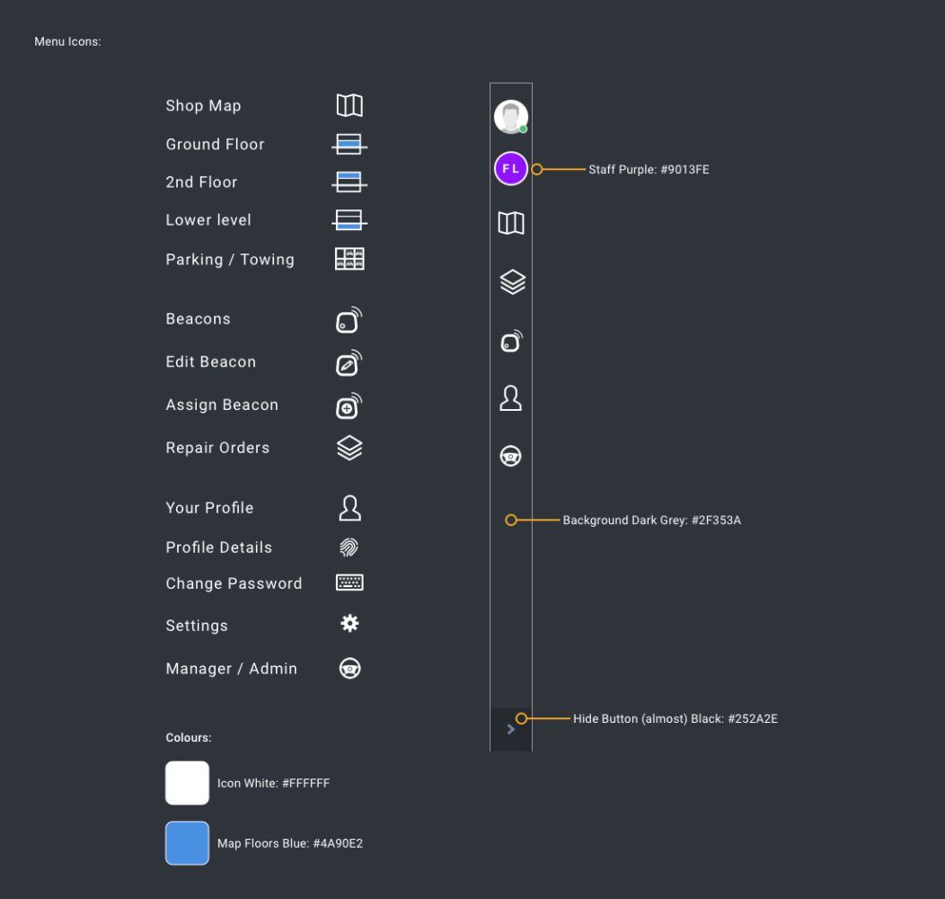
Additional icons were required for the app’s menus, which could collapse to take up less screen and allow more of the shop map to be seen. When collapsed, the text is not visible, so the icons had to be clear and memorable.
You can take the UX out of the title, but not out of the designer. This designer can’t help but think about the user and how the software will be used (as well as how it’ll look). In my first meeting with the project leads, I asked about language support and hinted that it would mean the software could support and be sold in more markets.
Throughout the process I was able to show how important it was to design for the user, reviewing mockups with the team and sharing the rationale behind design decisions. What originally was meant to be 5-6 weeks work to ‘create some icons’, became a little over 3 months work when the team realized that how the design worked was as important as how it looked. I created site architecture diagrams to organize the navigation into sensible categories, gave feedback on labelling and terminology used in the app, for more clarity. I’ve also encouraged the team to consider user-testing once the first release is ready in a few months and offered to help and give feedback.
This app will launch with one chain of autobody shops in Western Canada, but with added language support it has the potential to be used all over North America.


