When I joined MacLaren Interactive as an IA, the first projects I worked on were mobile versions of new vehicle launch sites for Cadillac and GM vehicles. This was 2008 and it was rare for a site to even have a mobile version, since this was years before the term ‘responsive’ was conceived.
Being the early adopter, I had the first iPhone and was the most familiar with mobile web as it existed. A friend living in San Francisco and working at Apple at the time had bought me an iPhone before a visit to Toronto. We had Agency-issued Blackberry’s, but most were grayscale screens and no one used them to browse websites, so I had an advantage and was given the job of designing the mobile sites. I went on to wireframe many of the sites and a year later, when building my portfolio and revisiting these sites to take screenshots, I discovered that my layouts were being used on newer mobile pages completed after I had left.
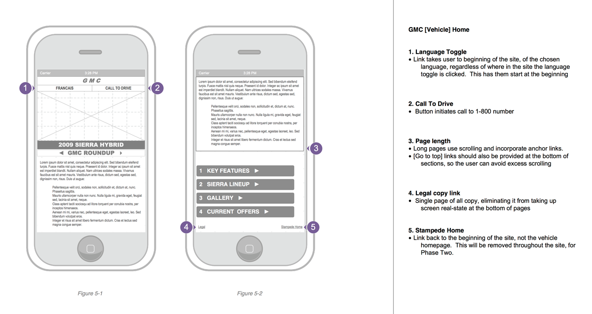
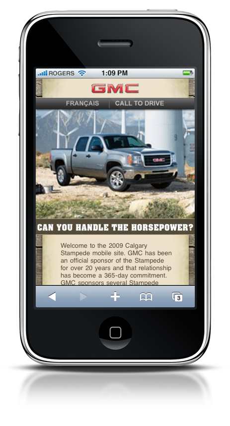
GMC Calgary Stampede mobile site wireframe example
Creating these mobile sites meant choosing only the necessary information and pushing back on the stakeholder’s inclination to cram the screens full of copy. Mobile screens were much smaller and of poorer resolution at the time of launch than what we’re accustomed to today.
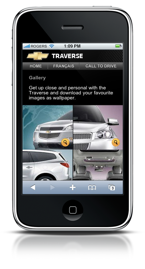
It was my suggestion that there be an option to enlarge images in the gallery, so that users could save the images and use them as wallpaper on their devices.
-

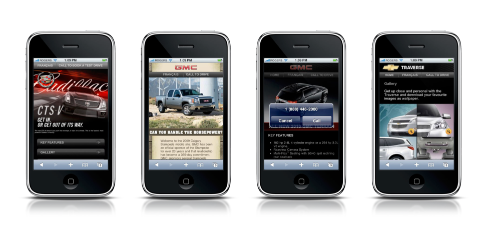
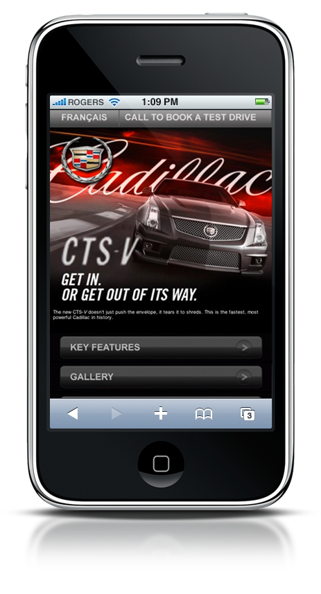
- Cadillac CTS V vehicle launch mobile site
-
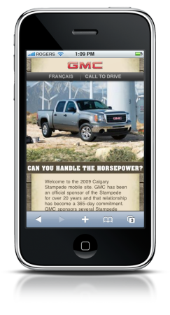
- GMC Calgary Stampede promotional site
-
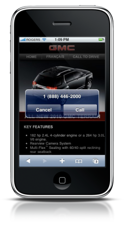
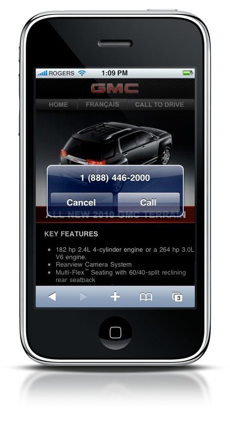
- Call to test drive the new GMC Terrain
-

- Chevrolet Traverse vehicle gallery